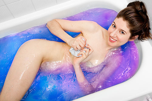
Laura Hollick and I shot a promotional photo to advertise of her upcoming Creativity Cleanse telecourse. It’s always a pleasure to shoot something that has such a strong concept just from the name. It wasn’t difficult to come up with the idea of a multicolored bath.
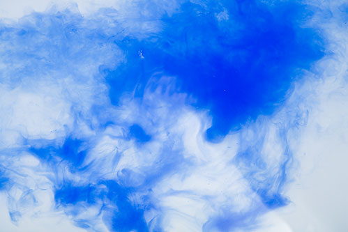
Because I had a good idea of what the finished image would look like, I was able to capture all of the elements on the day of the shoot. I knew I wanted the water in the bath to be some kind of color. In Photoshop, it’s relatively easy to change a color to some other color, but to realistically add color to something that doesn’t have color is difficult to do–at least for me, because I’m a photographer, not a painter! Coloring clear water would have been nearly impossible for me. So, we used some tempera paint to tint the water blue. As we added the paint to the tub, I shot a bunch of frames of the blue paint clouding the clear water, just in case they’d come in useful later.
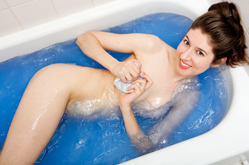
I set up a bare strobe to bounce light off the white ceiling. This gave us some bright and even light from above. Then we experimented with a few different poses to get the base photo. We ended up with the pose below because Laura’s body made an interesting and attractive shape, and we were able to cover everything that needed to be covered. I had Laura swish the water around in the tub before each shot to create some texture in the water and to further obscure herself.
Once I got the images into Photoshop, I started creating the rainbow effect. I tried a few different methods with masking, gradients, and hue and saturation layers. Eventually, I settled on using those images of the paint clouds in the clear water, because they were the only thing that looked organic and realistic enough to create that rainbow bath effect we wanted. I made a composite of several of these clouds, rotating them and shifting their hue and saturation to make them different colors.
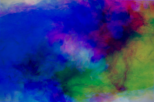
When layered on top of the bath image, this became the base for the rainbow effect. I used vector masks to allow non-water areas to show through. The Wacom tablet really helps in creating these masks. Touch sensitivity allows you to vary the brush size and pressure so that you can create smooth blends. I added a number of other layers of paint clouds of different colors, using different blending modes until it looked just right. Here’s the layers palette so you can see the various components.
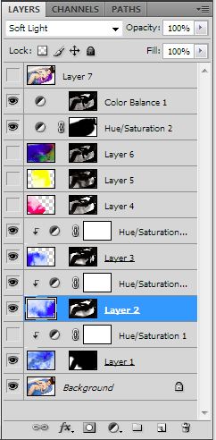
The challenge was to control which colors made it into the finished image, because it had to look bright and not muddy, colorful but not too cluttered. The final image actually didn’t use all of the color layers that I’d created. It was nice to have the options, but in the end, we decided on a simpler color combination that’s really in-line with Laura’s branding.
The final step was to put it into context on a banner that could be used on Laura’s website. I used more paint clouds to make it balance with the text and the white background. Voila!


I love seeing how you broke down the process Kevin. It looks like you went through your own creativity cleanse to make this image come to life!
I’m proud and delighted to use this to represent my Soul Art ‘Creativity Cleanse’ telecourse.
Working with you is one of my greatest joys!
totally awesome 🙂
Your work is amazing, Kevin.
Just in appreciation of the two creative forces here.
Thanks Ana!
totally awesome 🙂